


Looking for ways to create animated graphs in R programming? Check out this tutorial that provides step-by-step instructions on how to use various R libraries to create animated timelines, scatterplots, boxplots, violin plots, and more. You'll also find downloadable datasets and GIFs showcasing the final products. Whether you're a data scientist, researcher, or student, this guide can help you enhance your data visualization skills and impress your audience.
Download the used datasets in the tutorial:
Animated timeline
Load libraries
library(ggplot2)
library(gganimate)
library(tidyr)
library(tidyverse)
library(RColorBrewer)
library(rgeos)
library("sf")
library("rnaturalearth")
library("rnaturalearthdata")
library(lubridate)
library(ggExtra)
library(magick)
library(av)
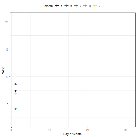
Animated wind timeline using 'airquality' data:
#View(airquality)
month<- factor(airquality$Month)
p <- ggplot(airquality,aes(Day, Wind, group = Month, color = month)) +
  geom_line(lwd=1.3) +
  geom_point(size=3)+
  theme_bw()+
  scale_color_viridis_d() +
  labs(x = "Day of Month", y = "Wind") +
  theme(legend.position = "top")
p
p + transition_reveal(Day)
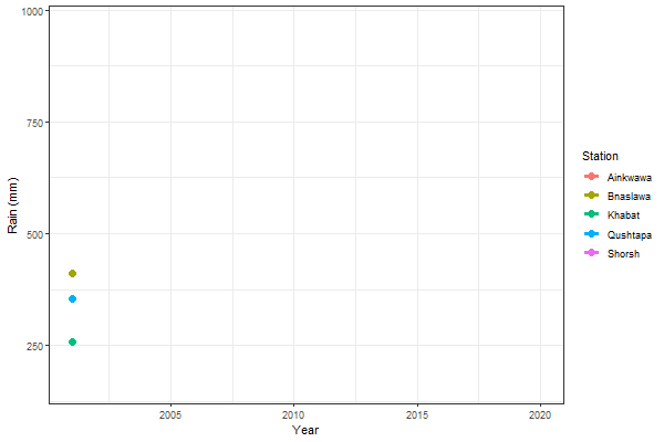
Animated rain timeline:
Load data:
df <- read.csv('D://R4Researchers//Erbil_Rain_Annual.csv')
#View(df)
Convert wide to long dataframe:
dflong <- gather(df, Station, Rain, Qushtapa:Shorsh)
Create graph:
p1<- ggplot(dflong, aes(x=year,y=Rain,color=Station, group=Station))+
  geom_line(lwd=1.3, show.legend = T)+
  geom_point(size=3, show.legend = T) +
  theme_bw()+
  xlab('Year')+
  ylab('Rain (mm)')
p1
Animate plot using transition_reveal() function:
anim<- p1 + transition_reveal(year)
animate(anim, height = 400, width =600)
Save the graph:
anim_save("animate_prece_Erbil_new_400&600.gif")
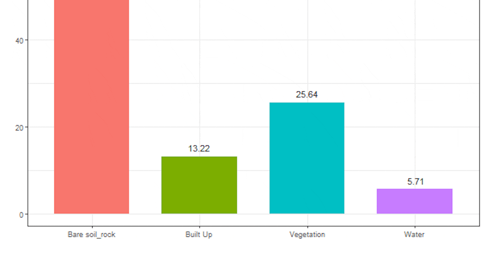
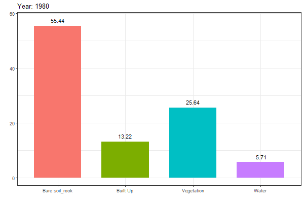
Animated geom_col
Import data:
da<-read.csv("D:\\R4Researchers\\LULC_Change.csv")
da1<- da[,1]
da2<- da[,2]
da3<- da[,3]
da3 <- as.factor(da3)
Create the graph using 'geom_col':
p <- ggplot(da, aes(x = da1, y = da2)) +
  geom_col(aes( fill = Class), position = position_dodge(0.8), width = 0.7,show.legend =F) +
  xlab("Land use/cover category")+
  ylab("% of area")+
  theme_bw()
p
Add text to the graph:
p1<- p + geom_text(data = da,
         aes(x = da1, group=da3, y = da2+2,
         label = format(da2, nsmall = 0, digits=3, scientific = FALSE)),
         color="black", position=position_dodge(.8), hjust=.5)
Animate the graph using transition_states() function:
anim<- p1 + transition_states(year, wrap = T)+
  labs(title = "Year: {closest_state}", y = 'Class %', x= 'Class')

animate(anim, height = 400, width =600)
anim_save("animate_barplot_LULC_Change_new.gif")
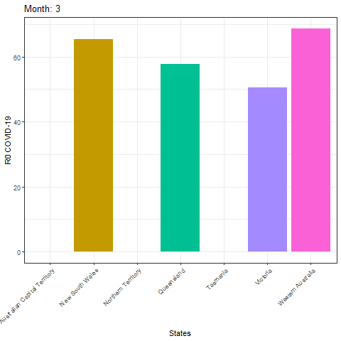
df <- read.csv('D://R4Researchers//Climatic_Variables_and_Lag7R0_Australia.csv')

p1<-ggplot(df)+
  geom_col(aes(y= lag7R0, x=area , fill =area),show.legend = F) + theme_bw()+
  theme(axis.text.x = element_text(angle = 45,hjust = 1))
p1

anim<- p1 + transition_time(month) +
  labs(title = "Month: {frame_time}", y = 'R0 COVID-19', x= 'States')
anim

anim_save("animate_boxplot_covid_Australia.gif")
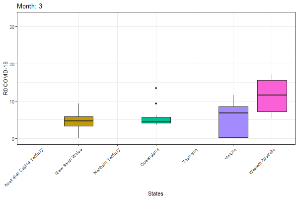
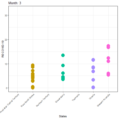
Animated boxplot
Load data:
dt <- read.csv('D://R4Researchers//Climatic_Variables_and_Lag7R0_Australia.csv')
Create boxplot:
p1<-ggplot(dt)+
  geom_boxplot(aes(y= lag7R0, x=area , fill =area),show.legend = F) +
  theme_bw() +
  theme(axis.text.x = element_text(angle = 45,hjust = 1)) +
  coord_cartesian(ylim = c(0,32.2))
p1
Animate the plot using transition_time() function:
anim<- p1 + transition_time(month) +
  labs(title = "Month: {frame_time}", y = 'R0 COVID-19', x= 'States') # using frmae_time for title
animate(anim, height = 400, width =600)
Save the gif:
anim_save("animate_boxplot_covid_Australia.gif")
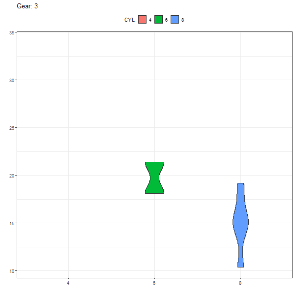
Animated violin
View mtcars data as table:
View(mtcars)
CYL <- factor(mtcars$cyl)
Create the graph:
p1 <- ggplot(mtcars, aes(CYL, mpg))+
  geom_violin(aes(fill = CYL))+
  theme_bw()+
  theme(legend.position = "top")
p1
Animate the graph with transition_states() function:
anim<- p1 + transition_states(gear,transition_length = 3, state_length = .5, wrap = T) +
  labs(title = "Gear: {closest_state}", y = '', x= '')
animate(anim, height = 600, width =600)
Save the gif:
anim_save("animate_geom_violin.gif")
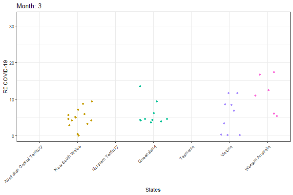
Animated jitter plot
df <- read.csv('D://R4Researchers//Climatic_Variables_and_Lag7R0_Australia.csv')

p1<-ggplot(df)+
  geom_jitter(aes(y= lag7R0, x=area , colour =area),show.legend = F) + theme_bw()+
  theme(axis.text.x = element_text(angle = 45,hjust = 1))
p1

anim<- p1 + transition_time(month) +
  labs(title = "Month: {frame_time}", y = 'R0 COVID-19', x= 'States')
animate(anim, height = 400, width =600)

anim_save("animate_geom_jitter_covid_Australia.gif")
b <- animate(anim, duration = 20, fps = 20, renderer = av_renderer())
anim_save("animate_geom_jitter.mp4", b) # save as mp4
Animated geom_count
df <- read.csv('D://R4Researchers//Climatic_Variables_and_Lag7R0_Australia.csv')

p1<-ggplot(df)+
  geom_count(aes(y= lag7R0, x= area, colour=area),show.legend = F) + theme_bw()+
  scale_size_area()+
  theme(axis.text.x = element_text(angle = 45,hjust = 1))#+
#coord_cartesian(ylim = c(0,20))
p1
anim<- p1 + transition_time(month) +
  labs(title = "Month: {frame_time}", y = 'R0 COVID-19', x= 'States')
anim

anim_save("animate_geom_count_covid_Australia.gif")
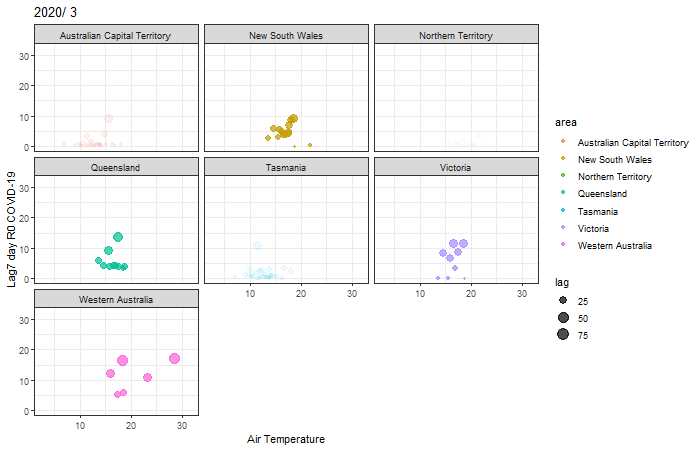
Multiple area animated scatterplot
df <- read.csv('D://R4Researchers//Climatic_Variables_and_Lag7R0_Australia.csv')
lag <- df$lag7R0*3

p1<- ggplot(df)+
  geom_point(aes( air_temp,lag7R0,size= lag, color = area),alpha = 0.7, show.legend = T)+ theme_bw()#+
p1

anim<- p1 + transition_time(month) +
  labs(title = "2020/ {frame_time}", x = 'Air Temperature', y= 'Lag7 day R0 COVID-19')+
  enter_fade() +
  facet_wrap(~area) #Use area to create multiple scatterplot

anim1<- animate(anim, fps=2, height = 450, width =700) # select height, width and speed frame per second 'fps:2'
anim1

anim_save("animate_sactterplot_Australia_Tempwrature.gif")
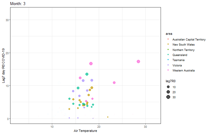
Animated scatterplot
df <- read.csv('D://R4Researchers//Climatic_Variables_and_Lag7R0_Australia.csv')

p2<- ggplot(df)+
  geom_point(aes( air_temp,lag7R0,size= lag7R0, color = area),alpha = 0.7, show.legend = T)+ theme_bw()
p2

pp2<- p2 + transition_time(month) +
  labs(title = "Month: {frame_time}", x = 'Air Temperature', y= 'Lag7 day R0 COVID-19')+
  enter_fade() +
  exit_fade()

anim1<- animate(pp2, fps=2, height = 450, width =700)

anim_save("animate_sactterplot_Australia_Tempwrature_one.gif")
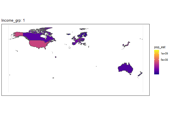
Animated map
world <- ne_countries(scale = "medium", returnclass = "sf")
#View(world)

gg<- ggplot(data = world) +
 # geom_sf(aes(fill = gdp_md_est)) +
  geom_sf(aes(fill = pop_est)) + #give different color to pop_est
  scale_fill_viridis_c(option = "plasma", trans = "sqrt")
gg

anim <- gg +  transition_manual(frames = income_grp, cumulative = F)+ #transition by incom_grp
  labs(title = "Income_grp: {frame}")+
  enter_fade() +
  exit_shrink()

animate(anim, height = 400, width =600)
anim_save("animate_geom_map_pop_Income.gif")
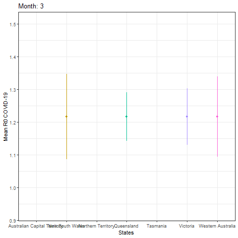
Animated linerange
df <- read.csv('D://R4Researchers//Climatic_Variables_and_Lag7R0_Australia.csv')
std <- function(x) sd(x)/sqrt(length(x))

dt<- df %>%
  group_by(area) %>%
  summarize(mean_lag = mean(lag7R0, na.rm=T), tt=std(lag7R0), month= month)
dt
df1<- df %>% mutate(dt)
#View(df1)

p1 <- ggplot() +
  geom_linerange(data=df1, mapping=aes(x=area, ymin=mean-tt, ymax=mean+tt, colour=area),show.legend = F) +
  geom_point(data=dt, mapping=aes(x=area, y=mean, colour=area),show.legend = F) +
  theme_bw()+
  theme(axis.text.x = element_text(angle = 45,hjust = 1))
p1

anim<- p1 + transition_time(month) +
labs(title = "Month: {frame_time}", y = 'Mean R0 COVID-19', x= 'States')
anim
#View(df1)
animate(anim,fps = 4, height = 400, width =600)

anim_save("animate_geom_linerange_Australia.gif")
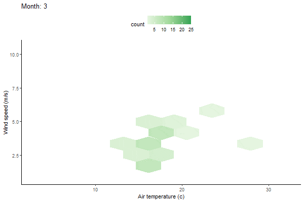
Animated bin hex
df <- read.csv('D://R4Researchers//Climatic_Variables_and_Lag7R0_Australia.csv')

p <- ggplot(df, aes(x=air_temp, y = ws))+
  stat_bin_hex(bins=10) +
  scale_fill_gradientn(colors = brewer.pal(3,"Greens")) +
  theme_classic() +
  theme(legend.position = "top")
p

anim <- p + transition_time(month) +
  labs(title = "Month: {frame_time}", x = 'Air temperature (c)', y= 'Wind speed (m/s)')

animate(anim,fps = 2, height = 400, width =600)
anim_save("animate_stat_bin_hex_Australia.gif")
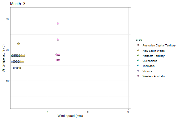
Animated dotplot
df <- read.csv('D://R4Researchers//Climatic_Variables_and_Lag7R0_Australia.csv')

p1<- ggplot(df, aes(y = air_temp,x= ws, fill = area),show.legend = F, alpha=0.6) +
  geom_dotplot(binwidth = 1.5, binaxis = "y", stackdir = "center", position = "dodge", drop=T, dotsize = 0.5, alpha=0.6)+
  theme_bw()
p1

anim<- p1 + transition_time(month) +
  labs(title = "Month: {frame_time}", x = 'Wind speed (m/s)', y= 'Air temperature(c)')
animate(anim, height = 500, width =500)

anim_save("animate_geom_dotplot_Australia.gif")
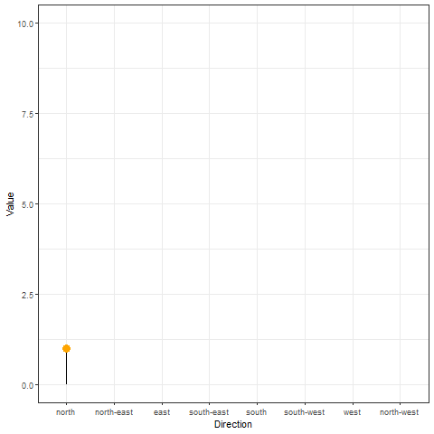
Animated geom_segment
# Dataset 1: one value per group
data <- data.frame(
  name=c("north","south","south-east","north-west","south-west","north-east","west","east"),
  val=sample(seq(1,10), 8 )
)

p1<-data %>%
  arrange(val) %>%
  mutate(name = factor(name, levels=c("north", "north-east", "east", "south-east", "south", "south-west", "west", "north-west"))) %>%
  ggplot( aes(x=name, y=val)) +
  geom_segment( aes(xend=name, yend=0)) +
  geom_point( size=4, color="orange") +
  theme_bw()

p1

anim<- p1 + transition_reveal(val)+
  labs(y = 'Value', x= 'Direction')
anim

anim_save("animated_geom_segment.gif")
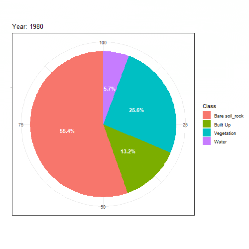
Animated pie chart
#Load data:
df<-read.csv("D:\\R4Researchers\\LULC_Change.csv")
df

# Create piechart:
bp<- ggplot(df, aes(x="", y=percent, fill=Class))+
  geom_bar(width = 1, stat = "identity")+
  theme_bw()+
  geom_text(aes(label = paste0(round(percent, 1), "%")), color = "white",
            position = position_stack(vjust = 0.5), fontface = "bold")+
  xlab('')+
  ylab('')
bp
pie <- bp + coord_polar("y", start=0)
pie

# Animate the graph:
anim<- pie + transition_time(year) + labs(title = "Year: {frame_time}")
anim

#Save gif:
anim_save("animate_pie_chart_LULC_Chane.gif")
In conclusion, this tutorial provides step-by-step instructions on how to use various R libraries to create animated graphs such as timelines, scatterplots, boxplots, violin plots, and more. It also includes downloadable datasets and GIFs showcasing the final products. Whether you're a data scientist, researcher, or student, this guide can help you enhance your data visualization skills and impress your audience.
If you enjoy the content, please consider subscribing to my YouTube channel for future updates.
To access video tutorials and receive a certificate, enroll in my Udemy course.